Atlas Label
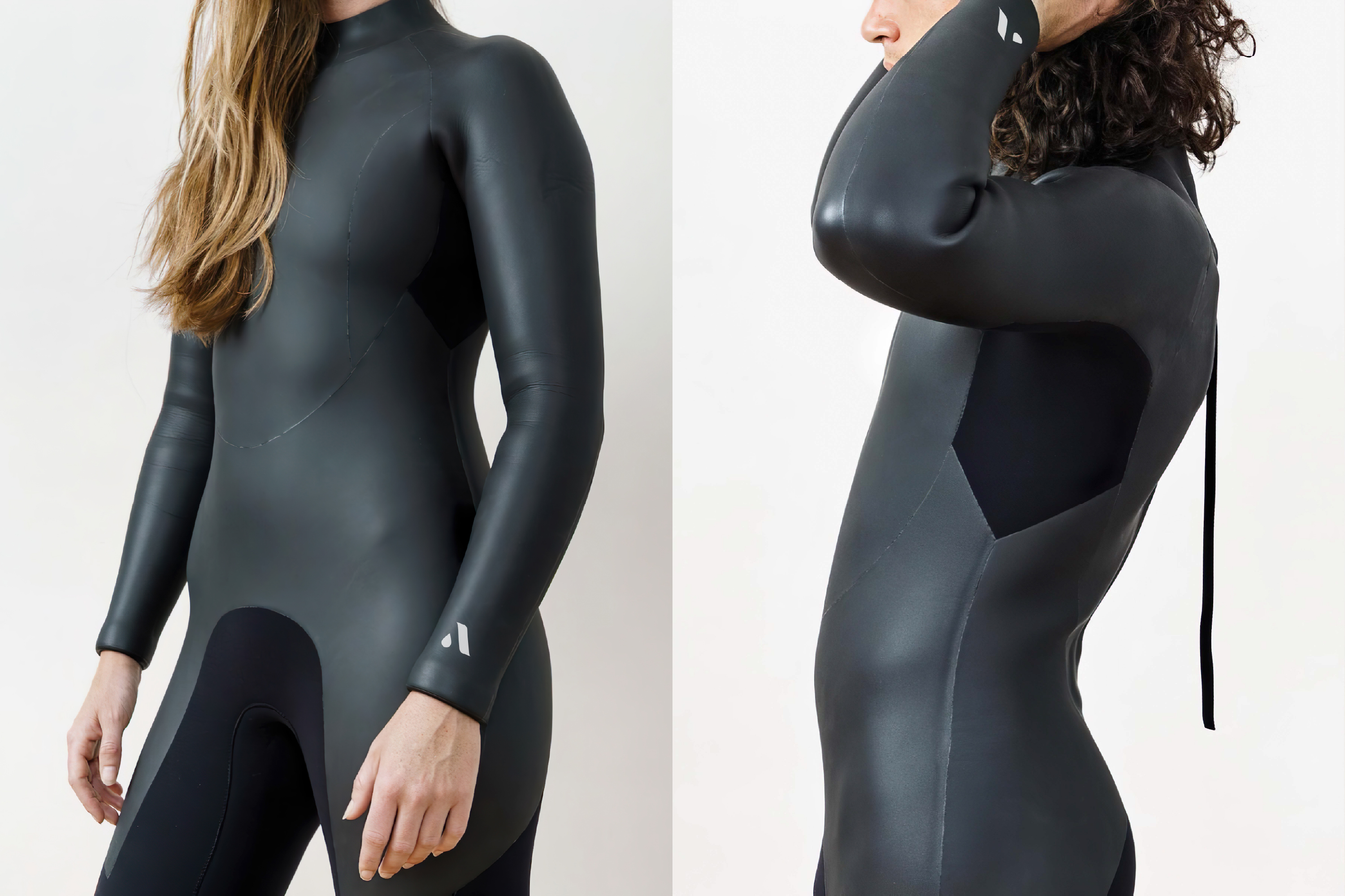
Based in Cape Town, Atlas Label is a surfing brand that carries swimwear and wetsuit with minimalist style. The product range exhibits a timelss luxury and sustainable lifestyle, which reuqires the visual strategy to reflect on.
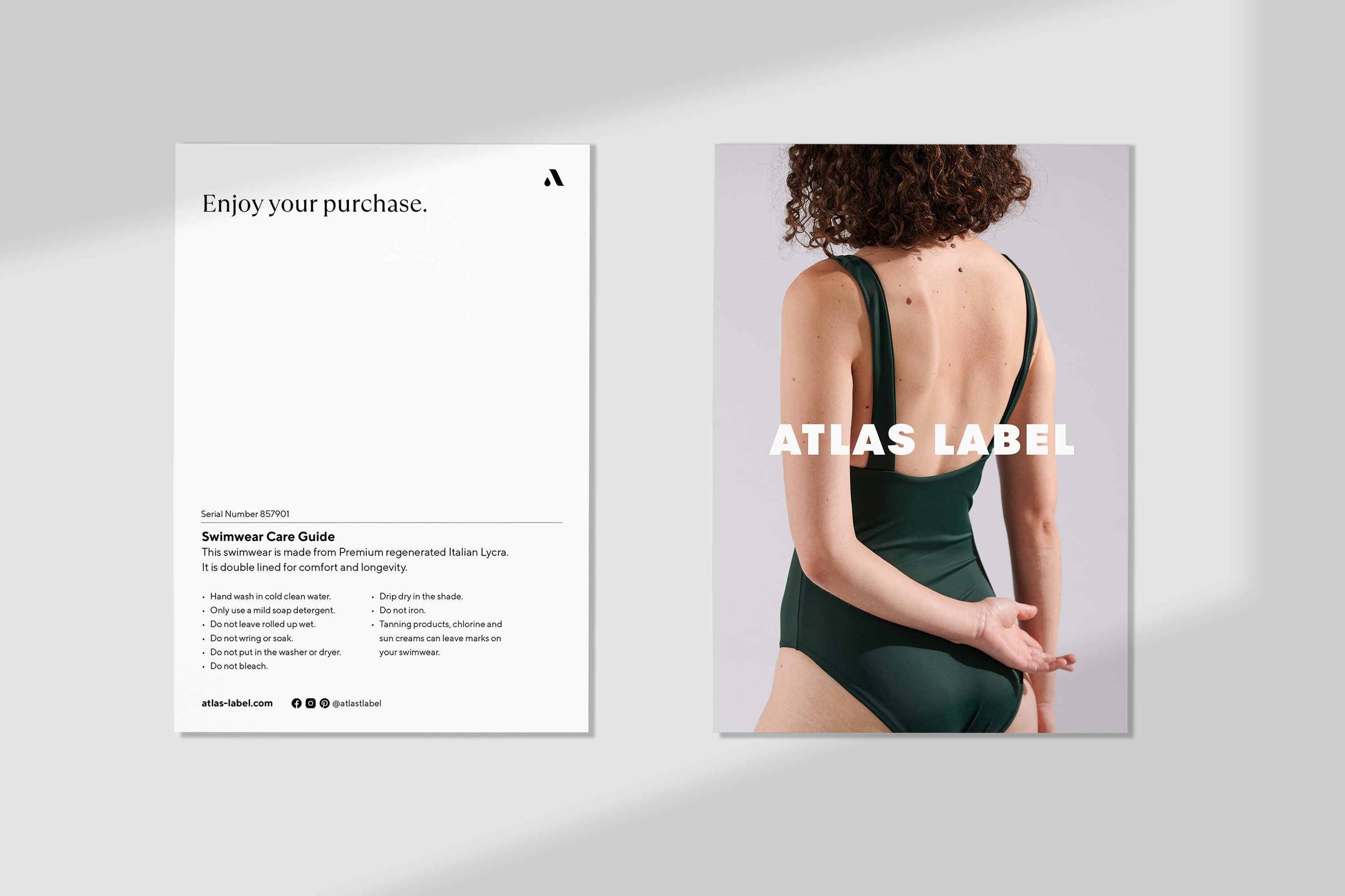
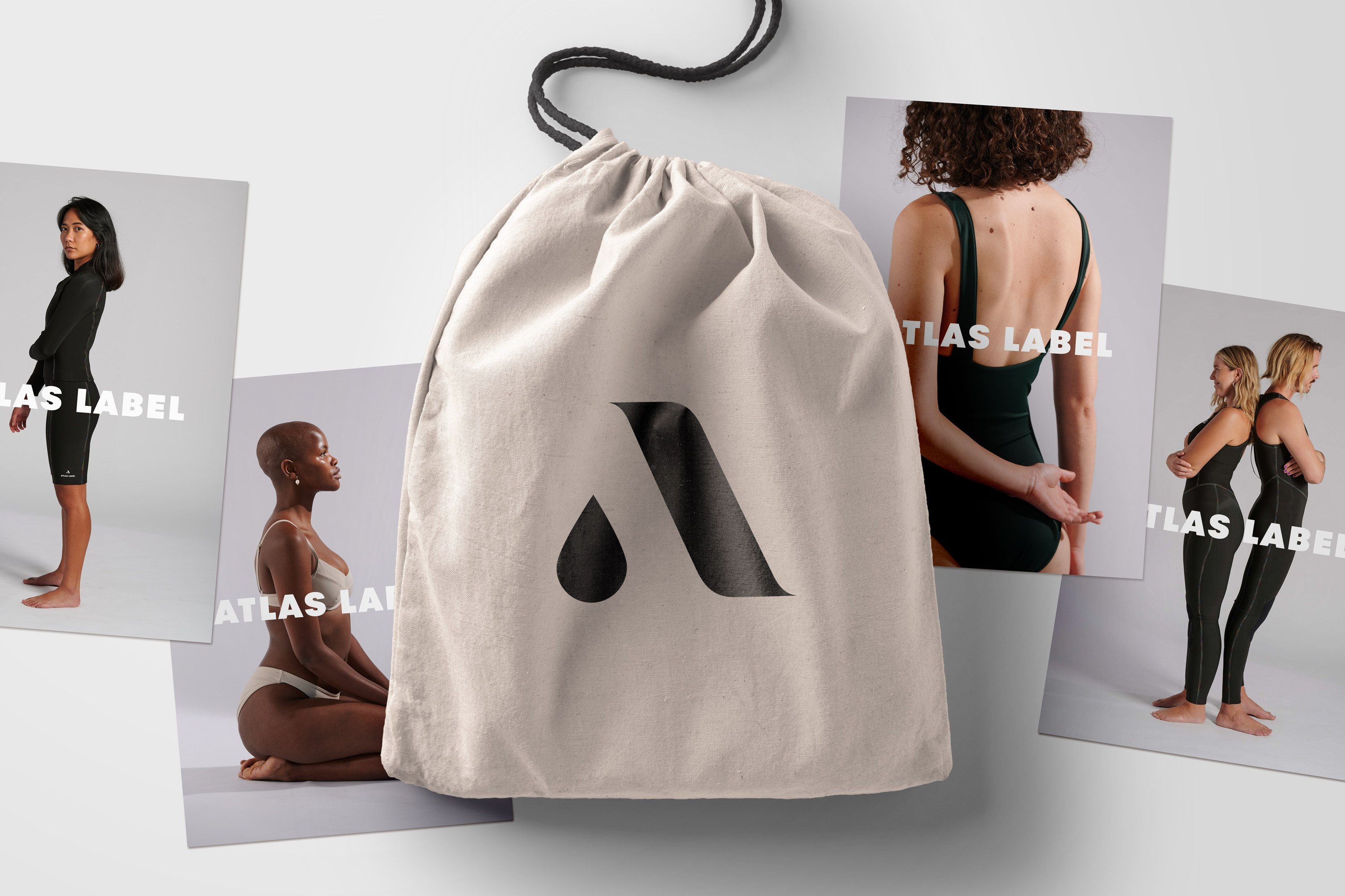
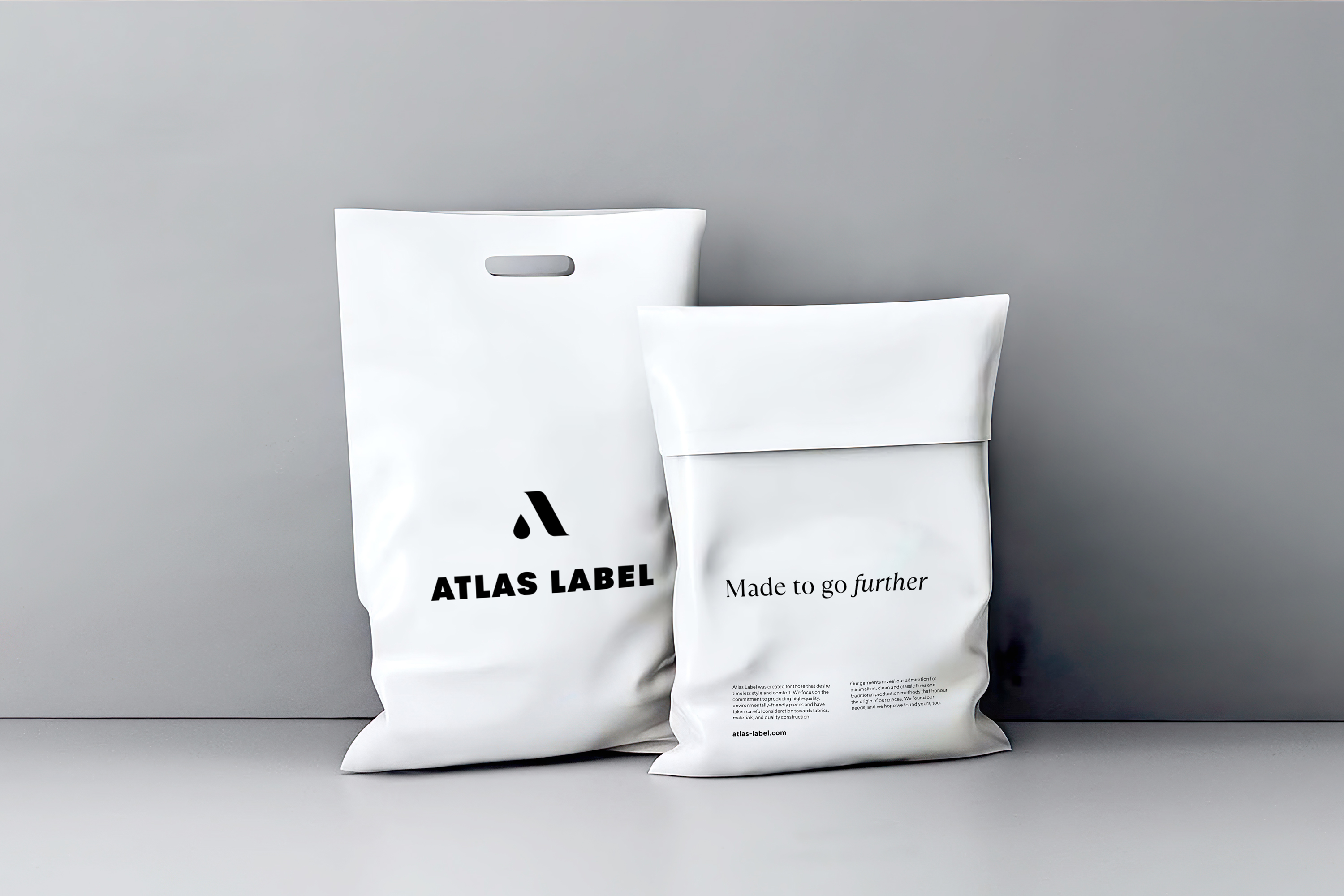
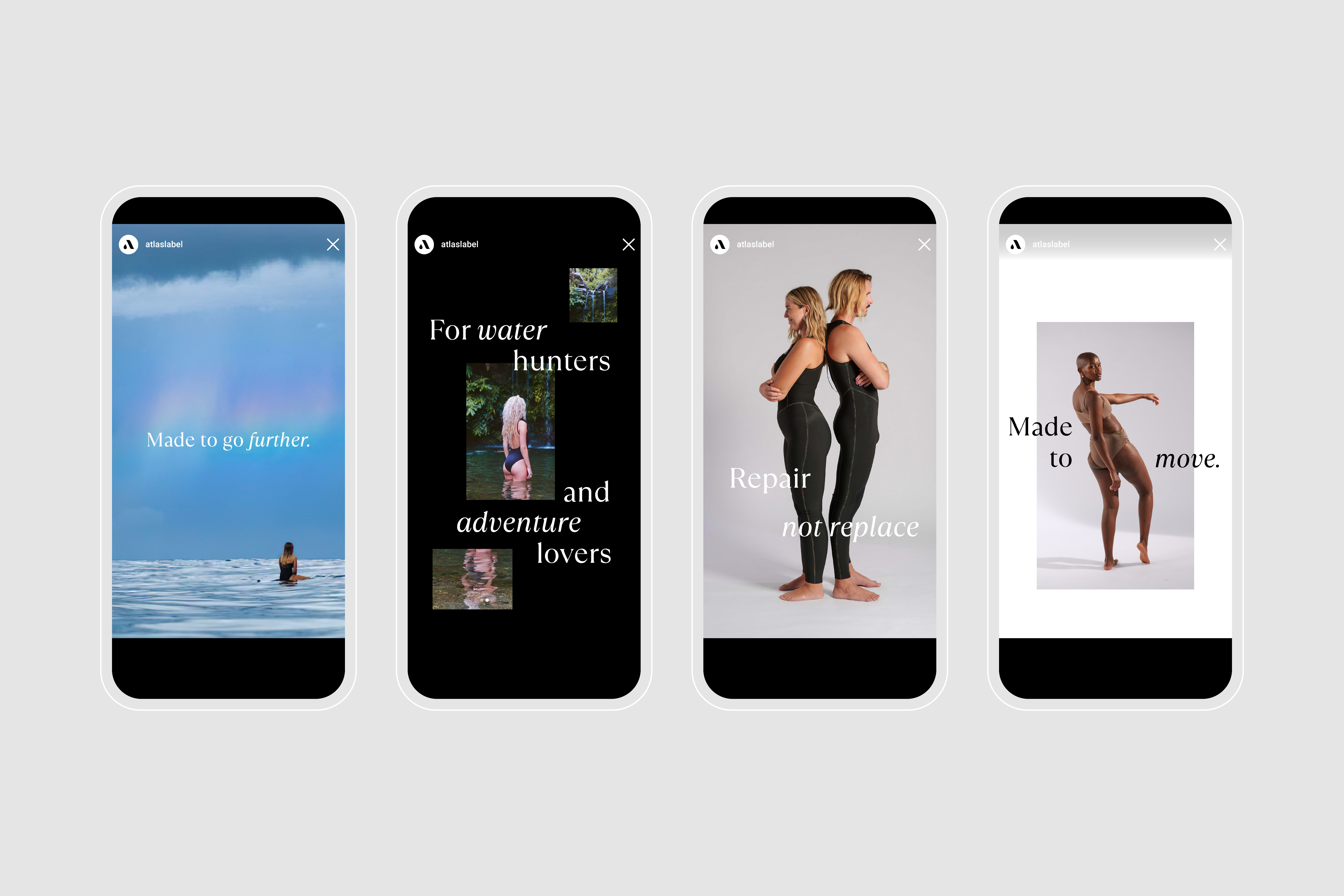
As an existing brand, the design brief was set to refine the visual elements to elevate the brand position. The primary logo, an ‘A’ made of a droplet and a stroke, hints the water and eastern calligraphy, referencing its Japanese production. The brandmark, made of the logo and the logotype, can be used separately for flexible applications. The rest of the branding assets maintain a minimalist approach, communicated through the muted colour palette, clean typography, and sustainable packaging. These updates not only just appeal to the likeminded but also displays the appreciation for craftsmanship.
As an existing brand, the design brief was set to refine the visual elements to elevate the brand position. The primary logo, an ‘A’ made of a droplet and a stroke, hints the water and eastern calligraphy, referencing its Japanese production. The brandmark, made of the logo and the logotype, can be used separately for flexible applications. The rest of the branding assets maintain a minimalist approach, communicated through the muted colour palette, clean typography, and sustainable packaging. These updates not only just appeal to the likeminded but also displays the appreciation for craftsmanship.


©Studio BRD 2020